- CSS Basics
- CSS Tutorial
- CSS Where to Write
- CSS Syntax
- CSS Selectors
- CSS Combinators
- CSS Attribute Selectors
- CSS Pseudo Classes
- CSS Pseudo-Classes
- CSS :link :hover :active
- CSS :first-child
- CSS :first-of-type
- CSS :last-child
- CSS :last-of-type
- CSS :only-child
- CSS :only-of-type
- CSS :nth-child()
- CSS :nth-of-type()
- CSS :nth-last-child()
- CSS :nth-last-of-type()
- CSS :focus
- CSS :not()
- CSS :root
- CSS :empty
- CSS :target
- CSS :lang()
- CSS :valid
- CSS :invalid
- CSS :optional
- CSS :required
- CSS :in-range
- CSS :out-of-range
- CSS :enabled :disabled
- CSS :read-only
- CSS :read-write
- CSS Pseudo Elements
- CSS Pseudo-Elements
- CSS ::before
- CSS ::after
- CSS ::first-letter
- CSS ::first-line
- CSS ::marker
- CSS ::selection
- CSS Colors
- CSS Colors
- CSS rgb() and rgba()
- CSS hsl() and hsla()
- CSS Background
- CSS background
- CSS background-color
- CSS background-image
- CSS linear-gradient()
- CSS radial-gradient()
- CSS conic-gradient()
- CSS repeating-linear-gradient()
- CSS repeating-radial-gradient()
- CSS repeating-conic-gradient()
- CSS background-position
- CSS background-size
- CSS background-repeat
- CSS background-origin
- CSS background-clip
- CSS background-attachment
- CSS background-blend-mode
- CSS Border
- CSS border
- CSS border-style
- CSS border-style Values
- CSS border-width
- CSS border-color
- CSS border-top
- CSS border-top-style
- CSS border-top-width
- CSS border-top-color
- CSS border-bottom
- CSS border-bottom-style
- CSS border-bottom-width
- CSS border-bottom-color
- CSS border-left
- CSS border-left-style
- CSS border-left-width
- CSS border-left-color
- CSS border-right
- CSS border-right-style
- CSS border-right-width
- CSS border-right-color
- CSS border-top-left-radius
- CSS border-top-right-radius
- CSS border-bottom-left-radius
- CSS border-bottom-right-radius
- CSS border-radius
- CSS border-collapse
- CSS empty-cells
- CSS border-spacing
- CSS border-image
- CSS border-image-source
- CSS border-image-slice
- CSS border-image-width
- CSS border-image-outset
- CSS border-image-repeat
- CSS Fonts
- CSS font
- CSS font-style
- CSS font-variant
- CSS font-variant-caps
- CSS font-weight
- CSS font-size
- CSS line-height
- CSS font-family
- CSS font-stretch
- CSS font-kerning
- CSS font-face
- CSS font-feature-settings
- CSS Text
- CSS Text
- CSS color
- CSS text-decoration
- CSS text-decoration-line
- CSS text-decoration-color
- CSS text-decoration-style
- CSS text-underline-position
- CSS text-align
- CSS text-align-last
- CSS text-justify
- CSS letter-spacing
- CSS word-spacing
- CSS text-shadow
- CSS text-transform
- CSS white-space
- CSS text-indent
- CSS word-wrap
- CSS overflow-wrap
- CSS word-break
- CSS text-overflow
- CSS hyphens
- CSS direction
- CSS unicode-bidi
- CSS writing-mode
- CSS Padding & Margin
- CSS Box Model
- CSS padding
- CSS padding-top
- CSS padding-right
- CSS padding-bottom
- CSS padding-left
- CSS margin
- CSS margin-top
- CSS margin-right
- CSS margin-bottom
- CSS margin-left
- CSS Padding Vs Margin
- CSS Dimensions
- CSS Dimensions
- CSS height
- CSS max-height
- CSS min-height
- CSS width
- CSS max-width
- CSS min-width
- CSS overflow
- CSS overflow-x
- CSS overflow-y
- CSS Multi-Column Layout
- CSS Multi-Column Layout
- CSS columns
- CSS column-width
- CSS column-count
- CSS column-rule
- CSS column-rule-width
- CSS column-rule-style
- CSS column-rule-color
- CSS column-span
- CSS column-fill
- CSS Display
- CSS display
- CSS inline Vs block
- CSS inline Vs inline-block
- CSS flex Vs inline-flex
- CSS inline-flex Vs inline-block
- CSS flex Vs grid
- CSS grid Vs inline-grid
- CSS Float and Position
- CSS float
- CSS clear
- CSS Align
- CSS position
- CSS left
- CSS right
- CSS top
- CSS bottom
- CSS Style List Marker
- CSS Style List Marker
- CSS list-style
- CSS list-style-type
- CSS list-style-position
- CSS list-style-image
- CSS Outline
- CSS outline
- CSS outline-width
- CSS outline-style
- CSS outline-color
- CSS outline-offset
- CSS Effects
- CSS Effects
- CSS Gradients
- CSS Shadows
- CSS box-shadow
- CSS opacity
- CSS Transforms
- CSS transform
- CSS translateX()
- CSS translateY()
- CSS translateZ()
- CSS translate()
- CSS translate3d()
- CSS scaleX()
- CSS scaleY()
- CSS scaleZ()
- CSS scale()
- CSS scale3d()
- CSS rotateX()
- CSS rotateY()
- CSS rotateZ()
- CSS rotate()
- CSS rotate3d()
- CSS skewX()
- CSS skewY()
- CSS skew()
- CSS matrix()
- CSS matrix3d()
- CSS perspective() Function
- CSS perspective Property
- CSS perspective-origin
- CSS transform-style
- CSS transform-origin
- CSS 2D Transform
- CSS 3D Transform
- CSS Transition
- CSS transition
- CSS transition-property
- CSS transition-duration
- CSS transition-timing-function
- CSS transition-delay
- CSS Animation
- CSS animation
- CSS @keyframes
- CSS animation-name
- CSS animation-duration
- CSS animation-timing-function
- CSS animation-delay
- CSS animation-iteration-count
- CSS animation-direction
- CSS animation-fill-mode
- CSS animation-play-state
- CSS Grid Layout
- CSS Grid Layout
- CSS gap
- CSS column-gap
- CSS row-gap
- CSS grid-area
- CSS grid-column-start
- CSS grid-column-end
- CSS grid-row-start
- CSS grid-row-end
- CSS grid-template
- CSS grid-template-columns
- CSS grid-template-rows
- CSS grid-template-areas
- CSS grid-auto-columns
- CSS grid-auto-rows
- CSS grid-auto-flow
- CSS grid-column
- CSS grid-row
- CSS Template Layout
- CSS Flex Layout
- CSS FlexBox
- CSS flex-direction
- CSS flex-wrap
- CSS flex-flow
- CSS justify-content
- CSS align-content
- CSS align-items
- CSS flex-grow
- CSS flex-shrink
- CSS flex-basis
- CSS flex
- CSS align-self
- CSS order
- CSS Misc
- CSS Length Units
- CSS Style Link
- CSS Navigation Bar
- CSS Style Image
- CSS Style Tables
- CSS table-layout
- CSS caption-side
- CSS Create Frames
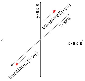
CSS transform: translateZ()
The CSS translateZ() function is used to define the transform property to move an element front/back on z-axis. The figure given below, shows how the translation of an element on z-axis performs:
It becomes difficult to understand the function translateZ(), until you see the effect on 3D box. Therefore, I've created a normal Die, and a Die whose font face (the face with value 1) is translated on Z-axis by 40px, like shown in the figure given below:
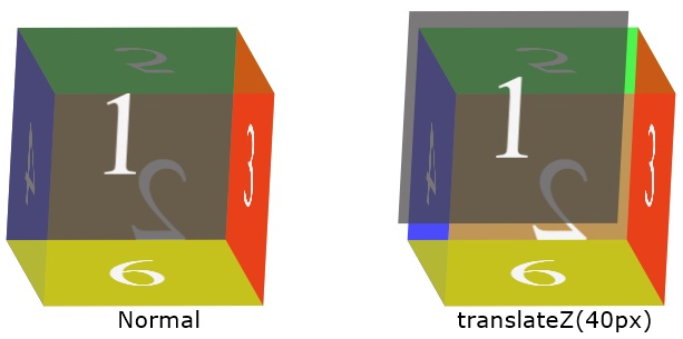
That is, the translation of an element using translateZ(), performs in this way:
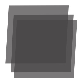
Because on the plane surface, it is not possible to show you, how the translateZ() function is used to translate an element on the z-axis, without using other properties, that helps to display the thing to visualize how the translateZ() function works.
Therefore, it is up to you, how you utilize this function, as I've explained how the function works. But let me create an example to show the sample work of translateZ() function, with an example:
<!DOCTYPE html>
<html>
<head>
   <style>
      #tzb {width: 160px; height: 160px; transform-style: preserve-3d;
         transform: rotate3d(12, -7, 1, 20deg); margin: 80px auto;}
      .a, .b, .c, .d {width: 100%; height: 100%; position: absolute;}
      .a {transform: translateZ(0px); background: rgba(10, 216, 96, 0.72);}
      .b {transform: translateZ(60px); background: rgba(233, 12, 12, 0.72);}
      .c {transform: translateZ(120px); background: rgba(181, 245, 6, 0.986);}
      .d {transform: translateZ(180px); background: rgba(70, 6, 245, 0.986);}
   </style>
</head>
<body>

   <div id="tzb">
      <div class="a"></div>
      <div class="b"></div>
      <div class="c"></div>
      <div class="d"></div>
   </div>

</body>
</html>
In above example, I've defined different color for the background of each translated DIV on the z-axis, to let you spot the change very clearly.
Note - The transform-style property is used set whether the child elements are positioned in 3D space or not.
Note - The rotate3d() function rotates an element along x-axis, y-axis, and z-axis, at once, with a particular degree.
CSS translateZ() Syntax
The syntax of translateZ() function in CSS, is:
transform: translateZ(length)
Note - Length units that can be used in CSS, are defined in its separate tutorial.
CSS translateZ() Example
<!DOCTYPE html>
<html>
<head>
   <style>
      #tzb {width: 160px; height: 160px; transform-style: preserve-3d;
         transform: rotate3d(1, 1, 1, 60deg); margin: 80px auto;}
      .a, .b, .c, .d, .e, .f {width: 100%; height: 100%; position: absolute;}
      .a {transform: translateZ(0px); background: green;}
      .b {transform: translateZ(60px); background: maroon;}
      .c {transform: translateZ(120px); background: yellow;}
      .d {transform: translateZ(140px); background: red;}
      .e {transform: translateZ(-60px); background: blue;}
      .f {transform: translateZ(-120px); background: gray;}

   </style>
</head>
<body>

   <div id="tzb">
      <div class="a"></div>
      <div class="b"></div>
      <div class="c"></div>
      <div class="d"></div>
      <div class="e"></div>
      <div class="f"></div>
   </div>

</body>
</html>
« Previous Tutorial Next Tutorial »