- CSS Basics
- CSS Tutorial
- CSS Where to Write
- CSS Syntax
- CSS Selectors
- CSS Combinators
- CSS Attribute Selectors
- CSS Pseudo Classes
- CSS Pseudo-Classes
- CSS :link :hover :active
- CSS :first-child
- CSS :first-of-type
- CSS :last-child
- CSS :last-of-type
- CSS :only-child
- CSS :only-of-type
- CSS :nth-child()
- CSS :nth-of-type()
- CSS :nth-last-child()
- CSS :nth-last-of-type()
- CSS :focus
- CSS :not()
- CSS :root
- CSS :empty
- CSS :target
- CSS :lang()
- CSS :valid
- CSS :invalid
- CSS :optional
- CSS :required
- CSS :in-range
- CSS :out-of-range
- CSS :enabled :disabled
- CSS :read-only
- CSS :read-write
- CSS Pseudo Elements
- CSS Pseudo-Elements
- CSS ::before
- CSS ::after
- CSS ::first-letter
- CSS ::first-line
- CSS ::marker
- CSS ::selection
- CSS Colors
- CSS Colors
- CSS rgb() and rgba()
- CSS hsl() and hsla()
- CSS Background
- CSS background
- CSS background-color
- CSS background-image
- CSS linear-gradient()
- CSS radial-gradient()
- CSS conic-gradient()
- CSS repeating-linear-gradient()
- CSS repeating-radial-gradient()
- CSS repeating-conic-gradient()
- CSS background-position
- CSS background-size
- CSS background-repeat
- CSS background-origin
- CSS background-clip
- CSS background-attachment
- CSS background-blend-mode
- CSS Border
- CSS border
- CSS border-style
- CSS border-style Values
- CSS border-width
- CSS border-color
- CSS border-top
- CSS border-top-style
- CSS border-top-width
- CSS border-top-color
- CSS border-bottom
- CSS border-bottom-style
- CSS border-bottom-width
- CSS border-bottom-color
- CSS border-left
- CSS border-left-style
- CSS border-left-width
- CSS border-left-color
- CSS border-right
- CSS border-right-style
- CSS border-right-width
- CSS border-right-color
- CSS border-top-left-radius
- CSS border-top-right-radius
- CSS border-bottom-left-radius
- CSS border-bottom-right-radius
- CSS border-radius
- CSS border-collapse
- CSS empty-cells
- CSS border-spacing
- CSS border-image
- CSS border-image-source
- CSS border-image-slice
- CSS border-image-width
- CSS border-image-outset
- CSS border-image-repeat
- CSS Fonts
- CSS font
- CSS font-style
- CSS font-variant
- CSS font-variant-caps
- CSS font-weight
- CSS font-size
- CSS line-height
- CSS font-family
- CSS font-stretch
- CSS font-kerning
- CSS font-face
- CSS font-feature-settings
- CSS Text
- CSS Text
- CSS color
- CSS text-decoration
- CSS text-decoration-line
- CSS text-decoration-color
- CSS text-decoration-style
- CSS text-underline-position
- CSS text-align
- CSS text-align-last
- CSS text-justify
- CSS letter-spacing
- CSS word-spacing
- CSS text-shadow
- CSS text-transform
- CSS white-space
- CSS text-indent
- CSS word-wrap
- CSS overflow-wrap
- CSS word-break
- CSS text-overflow
- CSS hyphens
- CSS direction
- CSS unicode-bidi
- CSS writing-mode
- CSS Padding & Margin
- CSS Box Model
- CSS padding
- CSS padding-top
- CSS padding-right
- CSS padding-bottom
- CSS padding-left
- CSS margin
- CSS margin-top
- CSS margin-right
- CSS margin-bottom
- CSS margin-left
- CSS Padding Vs Margin
- CSS Dimensions
- CSS Dimensions
- CSS height
- CSS max-height
- CSS min-height
- CSS width
- CSS max-width
- CSS min-width
- CSS overflow
- CSS overflow-x
- CSS overflow-y
- CSS Multi-Column Layout
- CSS Multi-Column Layout
- CSS columns
- CSS column-width
- CSS column-count
- CSS column-rule
- CSS column-rule-width
- CSS column-rule-style
- CSS column-rule-color
- CSS column-span
- CSS column-fill
- CSS Display
- CSS display
- CSS inline Vs block
- CSS inline Vs inline-block
- CSS flex Vs inline-flex
- CSS inline-flex Vs inline-block
- CSS flex Vs grid
- CSS grid Vs inline-grid
- CSS Float and Position
- CSS float
- CSS clear
- CSS Align
- CSS position
- CSS left
- CSS right
- CSS top
- CSS bottom
- CSS Style List Marker
- CSS Style List Marker
- CSS list-style
- CSS list-style-type
- CSS list-style-position
- CSS list-style-image
- CSS Outline
- CSS outline
- CSS outline-width
- CSS outline-style
- CSS outline-color
- CSS outline-offset
- CSS Effects
- CSS Effects
- CSS Gradients
- CSS Shadows
- CSS box-shadow
- CSS opacity
- CSS Transforms
- CSS transform
- CSS translateX()
- CSS translateY()
- CSS translateZ()
- CSS translate()
- CSS translate3d()
- CSS scaleX()
- CSS scaleY()
- CSS scaleZ()
- CSS scale()
- CSS scale3d()
- CSS rotateX()
- CSS rotateY()
- CSS rotateZ()
- CSS rotate()
- CSS rotate3d()
- CSS skewX()
- CSS skewY()
- CSS skew()
- CSS matrix()
- CSS matrix3d()
- CSS perspective() Function
- CSS perspective Property
- CSS perspective-origin
- CSS transform-style
- CSS transform-origin
- CSS 2D Transform
- CSS 3D Transform
- CSS Transition
- CSS transition
- CSS transition-property
- CSS transition-duration
- CSS transition-timing-function
- CSS transition-delay
- CSS Animation
- CSS animation
- CSS @keyframes
- CSS animation-name
- CSS animation-duration
- CSS animation-timing-function
- CSS animation-delay
- CSS animation-iteration-count
- CSS animation-direction
- CSS animation-fill-mode
- CSS animation-play-state
- CSS Grid Layout
- CSS Grid Layout
- CSS gap
- CSS column-gap
- CSS row-gap
- CSS grid-area
- CSS grid-column-start
- CSS grid-column-end
- CSS grid-row-start
- CSS grid-row-end
- CSS grid-template
- CSS grid-template-columns
- CSS grid-template-rows
- CSS grid-template-areas
- CSS grid-auto-columns
- CSS grid-auto-rows
- CSS grid-auto-flow
- CSS grid-column
- CSS grid-row
- CSS Template Layout
- CSS Flex Layout
- CSS FlexBox
- CSS flex-direction
- CSS flex-wrap
- CSS flex-flow
- CSS justify-content
- CSS align-content
- CSS align-items
- CSS flex-grow
- CSS flex-shrink
- CSS flex-basis
- CSS flex
- CSS align-self
- CSS order
- CSS Misc
- CSS Length Units
- CSS Style Link
- CSS Navigation Bar
- CSS Style Image
- CSS Style Tables
- CSS table-layout
- CSS caption-side
- CSS Create Frames
CSS border-image-source: Define the Source of the Border Image
The CSS border-image-source property is used to specify the source or path of the image used to create the border around an element. For example:
<!DOCTYPE html>
<html>
<head>
   <style>
      p {border: 15px solid transparent; padding: 10px;
         border-image-source: url(images/border-image-demo.png);
         border-image-slice: 12;}
   </style>
</head>
<body>

   <p>This is a para.</p>

</body>
</html>
This is a para.
In the above example, the border property sets the width, style, and color of an element's border. The border in this case has a width of 15 pixels, a solid style, and a transparent color.
Now the padding property specifies the amount of space between the content of an element and its border. The padding is set to 10 pixels in this case.
Then the border-image-source property specifies the image to be used as an element's border. The image file's URL in this case is images/border-image-demo.png.
Finally, the border-image-slice defines how the border image should be sliced and stretched to fit the element's border. The value of 12 in this case indicates that the border image should be divided into 9 equal parts (4 corners, 4 edges, and 1 middle), with only the middle part stretched to fit the element's border.
In the above program, the image used is:
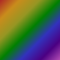
CSS border-image-source syntax
The syntax of the border-image-source property in CSS is:
border-image-source: x;
The value of x should be any of the following:
- imagePath: used to specify the source or path of an image
- none: used to specify no image
- initial: used to set the default value
- inherit: used to inherit and set the value from its parent
Advantages of the border-image-source property in CSS
- Instead of relying on predefined border styles, the "border-image-source" property enables developers to create custom borders using images.
- The border will look good on any device or screen size because the border image can be scaled to any size.
- The "border-image-source" property can help keep the HTML code neat and organized by reducing the need for additional markup to create custom borders.
Disadvantages of the border-image-source property in CSS
- Some users might not see the custom border because some web browsers do not support the "border-image-source" property.
- The performance of the web page may be impacted by the border image's size, particularly if it is large or complex.
- It can be trickier for beginners to use because creating custom borders using the "border-image-source" property can be more complicated than using regular border styles.
« Previous Tutorial Next Tutorial »