- CSS Basics
- CSS Tutorial
- CSS Where to Write
- CSS Syntax
- CSS Selectors
- CSS Combinators
- CSS Attribute Selectors
- CSS Pseudo Classes
- CSS Pseudo-Classes
- CSS :link :hover :active
- CSS :first-child
- CSS :first-of-type
- CSS :last-child
- CSS :last-of-type
- CSS :only-child
- CSS :only-of-type
- CSS :nth-child()
- CSS :nth-of-type()
- CSS :nth-last-child()
- CSS :nth-last-of-type()
- CSS :focus
- CSS :not()
- CSS :root
- CSS :empty
- CSS :target
- CSS :lang()
- CSS :valid
- CSS :invalid
- CSS :optional
- CSS :required
- CSS :in-range
- CSS :out-of-range
- CSS :enabled :disabled
- CSS :read-only
- CSS :read-write
- CSS Pseudo Elements
- CSS Pseudo-Elements
- CSS ::before
- CSS ::after
- CSS ::first-letter
- CSS ::first-line
- CSS ::marker
- CSS ::selection
- CSS Colors
- CSS Colors
- CSS rgb() and rgba()
- CSS hsl() and hsla()
- CSS Background
- CSS background
- CSS background-color
- CSS background-image
- CSS linear-gradient()
- CSS radial-gradient()
- CSS conic-gradient()
- CSS repeating-linear-gradient()
- CSS repeating-radial-gradient()
- CSS repeating-conic-gradient()
- CSS background-position
- CSS background-size
- CSS background-repeat
- CSS background-origin
- CSS background-clip
- CSS background-attachment
- CSS background-blend-mode
- CSS Border
- CSS border
- CSS border-style
- CSS border-style Values
- CSS border-width
- CSS border-color
- CSS border-top
- CSS border-top-style
- CSS border-top-width
- CSS border-top-color
- CSS border-bottom
- CSS border-bottom-style
- CSS border-bottom-width
- CSS border-bottom-color
- CSS border-left
- CSS border-left-style
- CSS border-left-width
- CSS border-left-color
- CSS border-right
- CSS border-right-style
- CSS border-right-width
- CSS border-right-color
- CSS border-top-left-radius
- CSS border-top-right-radius
- CSS border-bottom-left-radius
- CSS border-bottom-right-radius
- CSS border-radius
- CSS border-collapse
- CSS empty-cells
- CSS border-spacing
- CSS border-image
- CSS border-image-source
- CSS border-image-slice
- CSS border-image-width
- CSS border-image-outset
- CSS border-image-repeat
- CSS Fonts
- CSS font
- CSS font-style
- CSS font-variant
- CSS font-variant-caps
- CSS font-weight
- CSS font-size
- CSS line-height
- CSS font-family
- CSS font-stretch
- CSS font-kerning
- CSS font-face
- CSS font-feature-settings
- CSS Text
- CSS Text
- CSS color
- CSS text-decoration
- CSS text-decoration-line
- CSS text-decoration-color
- CSS text-decoration-style
- CSS text-underline-position
- CSS text-align
- CSS text-align-last
- CSS text-justify
- CSS letter-spacing
- CSS word-spacing
- CSS text-shadow
- CSS text-transform
- CSS white-space
- CSS text-indent
- CSS word-wrap
- CSS overflow-wrap
- CSS word-break
- CSS text-overflow
- CSS hyphens
- CSS direction
- CSS unicode-bidi
- CSS writing-mode
- CSS Padding & Margin
- CSS Box Model
- CSS padding
- CSS padding-top
- CSS padding-right
- CSS padding-bottom
- CSS padding-left
- CSS margin
- CSS margin-top
- CSS margin-right
- CSS margin-bottom
- CSS margin-left
- CSS Padding Vs Margin
- CSS Dimensions
- CSS Dimensions
- CSS height
- CSS max-height
- CSS min-height
- CSS width
- CSS max-width
- CSS min-width
- CSS overflow
- CSS overflow-x
- CSS overflow-y
- CSS Multi-Column Layout
- CSS Multi-Column Layout
- CSS columns
- CSS column-width
- CSS column-count
- CSS column-rule
- CSS column-rule-width
- CSS column-rule-style
- CSS column-rule-color
- CSS column-span
- CSS column-fill
- CSS Display
- CSS display
- CSS inline Vs block
- CSS inline Vs inline-block
- CSS flex Vs inline-flex
- CSS inline-flex Vs inline-block
- CSS flex Vs grid
- CSS grid Vs inline-grid
- CSS Float and Position
- CSS float
- CSS clear
- CSS Align
- CSS position
- CSS left
- CSS right
- CSS top
- CSS bottom
- CSS Style List Marker
- CSS Style List Marker
- CSS list-style
- CSS list-style-type
- CSS list-style-position
- CSS list-style-image
- CSS Outline
- CSS outline
- CSS outline-width
- CSS outline-style
- CSS outline-color
- CSS outline-offset
- CSS Effects
- CSS Effects
- CSS Gradients
- CSS Shadows
- CSS box-shadow
- CSS opacity
- CSS Transforms
- CSS transform
- CSS translateX()
- CSS translateY()
- CSS translateZ()
- CSS translate()
- CSS translate3d()
- CSS scaleX()
- CSS scaleY()
- CSS scaleZ()
- CSS scale()
- CSS scale3d()
- CSS rotateX()
- CSS rotateY()
- CSS rotateZ()
- CSS rotate()
- CSS rotate3d()
- CSS skewX()
- CSS skewY()
- CSS skew()
- CSS matrix()
- CSS matrix3d()
- CSS perspective() Function
- CSS perspective Property
- CSS perspective-origin
- CSS transform-style
- CSS transform-origin
- CSS 2D Transform
- CSS 3D Transform
- CSS Transition
- CSS transition
- CSS transition-property
- CSS transition-duration
- CSS transition-timing-function
- CSS transition-delay
- CSS Animation
- CSS animation
- CSS @keyframes
- CSS animation-name
- CSS animation-duration
- CSS animation-timing-function
- CSS animation-delay
- CSS animation-iteration-count
- CSS animation-direction
- CSS animation-fill-mode
- CSS animation-play-state
- CSS Grid Layout
- CSS Grid Layout
- CSS gap
- CSS column-gap
- CSS row-gap
- CSS grid-area
- CSS grid-column-start
- CSS grid-column-end
- CSS grid-row-start
- CSS grid-row-end
- CSS grid-template
- CSS grid-template-columns
- CSS grid-template-rows
- CSS grid-template-areas
- CSS grid-auto-columns
- CSS grid-auto-rows
- CSS grid-auto-flow
- CSS grid-column
- CSS grid-row
- CSS Template Layout
- CSS Flex Layout
- CSS FlexBox
- CSS flex-direction
- CSS flex-wrap
- CSS flex-flow
- CSS justify-content
- CSS align-content
- CSS align-items
- CSS flex-grow
- CSS flex-shrink
- CSS flex-basis
- CSS flex
- CSS align-self
- CSS order
- CSS Misc
- CSS Length Units
- CSS Style Link
- CSS Navigation Bar
- CSS Style Image
- CSS Style Tables
- CSS table-layout
- CSS caption-side
- CSS Create Frames
CSS: How to Add Shadows
Using CSS, we can add multiple types of shadows to an HTML element to make the element look more interactive and highlighted. To do this, here are the two properties we need to understand:
For example:
<!DOCTYPE html>
<html>
<head>
   <style>
      div{margin: 30px 10px; border: 1px solid; padding: 12px;}
      div.a{text-shadow: 4px 4px 10px red;}
      div.b{box-shadow: 4px 4px 10px blue;}
   </style>
</head>
<body>

   <div class="a">text-shadow: 4px 4px 10px red</div>
   <div class="b">box-shadow: 4px 4px 10px blue</div>

</body>
</html>
The code defines two "div" elements with different shadow styles.
The first div has the class "a" and uses the text-shadow property. This adds a shadow effect behind the text within the element, with a horizontal and vertical offset of 4 pixels and a blur radius of 10 pixels. As a result, the text appears to be 3D, with a red shadow behind it.
The second div has the class "b" and uses the box-shadow property. This applies a shadow effect to the entire element, with a horizontal and vertical offset of 4 pixels and a blur radius of 10 pixels. As a result, the entire element appears to float above the page, surrounded by a blue shadow.
The CSS box-shadow module, which enables you to add a shadow effect to an element, includes both text-shadow and box-shadow. The primary distinction between the two is that while box-shadow applies the shadow effect to the entire element (including any child elements), text-shadow only applies it to the text within an element. Additionally, a wider range of shadow effects, including multiple shadows, inset shadows, and more complicated shapes, can be produced using box-shadow.
The two properties that can be used to define a shadow behind a box or text are already covered in their separate posts. So you can visit those posts to learn in detail.
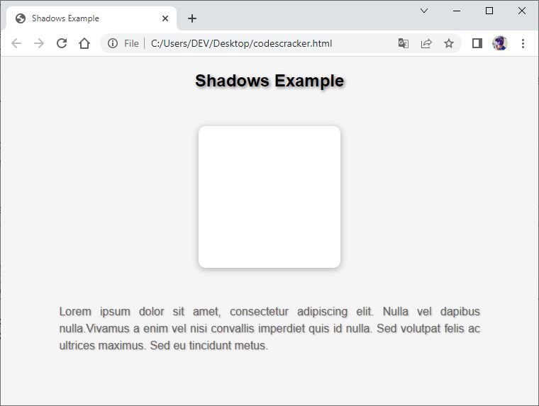
Now, before we close the discussion on creating shadows using CSS, I want to include one more example demonstrating the use of shadow to make the web page look more elegant.
<!DOCTYPE html>
<html>
<head>
  <title>Shadows Example</title>
  <style>
    body {
      background-color: #f5f5f5;
      font-family: Arial, sans-serif;
    }

    h2 {
      text-align: center;
      text-shadow: 2px 2px 4px rgba(0, 0, 0, 0.5);
    }

    .box {
      width: 200px;
      height: 200px;
      margin: 50px auto;
      background-color: #fff;
      box-shadow: 0px 2px 10px rgba(0, 0, 0, 0.3);
      border-radius: 10px;
      transition: all 0.3s ease-in-out;
    }

    .box:hover {
      transform: translateY(-10px);
      box-shadow: 0px 10px 20px rgba(0, 0, 0, 0.5);
    }

    p {
      text-align: justify;
      text-justify: inter-word;
      line-height: 1.5;
      margin: 30px auto;
      width: 80%;
      font-size: 16px;
      color: #666;
      text-shadow: 1px 1px 2px rgba(0, 0, 0, 0.3);
    }
  </style>
</head>
<body>

   <h2>Shadows Example</h2>

   <div class="box"></div>

   <p>Lorem ipsum dolor sit amet, consectetur adipiscing elit. Nulla vel
   dapibus nulla.Vivamus a enim vel nisi convallis imperdiet quis id nulla.
   Sed volutpat felis ac ultrices maximus. Sed eu tincidunt metus.</p>

</body>
</html>
The output should be:
« Previous Tutorial Next Tutorial »