- CSS Basics
- CSS Tutorial
- CSS Where to Write
- CSS Syntax
- CSS Selectors
- CSS Combinators
- CSS Attribute Selectors
- CSS Pseudo Classes
- CSS Pseudo-Classes
- CSS :link :hover :active
- CSS :first-child
- CSS :first-of-type
- CSS :last-child
- CSS :last-of-type
- CSS :only-child
- CSS :only-of-type
- CSS :nth-child()
- CSS :nth-of-type()
- CSS :nth-last-child()
- CSS :nth-last-of-type()
- CSS :focus
- CSS :not()
- CSS :root
- CSS :empty
- CSS :target
- CSS :lang()
- CSS :valid
- CSS :invalid
- CSS :optional
- CSS :required
- CSS :in-range
- CSS :out-of-range
- CSS :enabled :disabled
- CSS :read-only
- CSS :read-write
- CSS Pseudo Elements
- CSS Pseudo-Elements
- CSS ::before
- CSS ::after
- CSS ::first-letter
- CSS ::first-line
- CSS ::marker
- CSS ::selection
- CSS Colors
- CSS Colors
- CSS rgb() and rgba()
- CSS hsl() and hsla()
- CSS Background
- CSS background
- CSS background-color
- CSS background-image
- CSS linear-gradient()
- CSS radial-gradient()
- CSS conic-gradient()
- CSS repeating-linear-gradient()
- CSS repeating-radial-gradient()
- CSS repeating-conic-gradient()
- CSS background-position
- CSS background-size
- CSS background-repeat
- CSS background-origin
- CSS background-clip
- CSS background-attachment
- CSS background-blend-mode
- CSS Border
- CSS border
- CSS border-style
- CSS border-style Values
- CSS border-width
- CSS border-color
- CSS border-top
- CSS border-top-style
- CSS border-top-width
- CSS border-top-color
- CSS border-bottom
- CSS border-bottom-style
- CSS border-bottom-width
- CSS border-bottom-color
- CSS border-left
- CSS border-left-style
- CSS border-left-width
- CSS border-left-color
- CSS border-right
- CSS border-right-style
- CSS border-right-width
- CSS border-right-color
- CSS border-top-left-radius
- CSS border-top-right-radius
- CSS border-bottom-left-radius
- CSS border-bottom-right-radius
- CSS border-radius
- CSS border-collapse
- CSS empty-cells
- CSS border-spacing
- CSS border-image
- CSS border-image-source
- CSS border-image-slice
- CSS border-image-width
- CSS border-image-outset
- CSS border-image-repeat
- CSS Fonts
- CSS font
- CSS font-style
- CSS font-variant
- CSS font-variant-caps
- CSS font-weight
- CSS font-size
- CSS line-height
- CSS font-family
- CSS font-stretch
- CSS font-kerning
- CSS font-face
- CSS font-feature-settings
- CSS Text
- CSS Text
- CSS color
- CSS text-decoration
- CSS text-decoration-line
- CSS text-decoration-color
- CSS text-decoration-style
- CSS text-underline-position
- CSS text-align
- CSS text-align-last
- CSS text-justify
- CSS letter-spacing
- CSS word-spacing
- CSS text-shadow
- CSS text-transform
- CSS white-space
- CSS text-indent
- CSS word-wrap
- CSS overflow-wrap
- CSS word-break
- CSS text-overflow
- CSS hyphens
- CSS direction
- CSS unicode-bidi
- CSS writing-mode
- CSS Padding & Margin
- CSS Box Model
- CSS padding
- CSS padding-top
- CSS padding-right
- CSS padding-bottom
- CSS padding-left
- CSS margin
- CSS margin-top
- CSS margin-right
- CSS margin-bottom
- CSS margin-left
- CSS Padding Vs Margin
- CSS Dimensions
- CSS Dimensions
- CSS height
- CSS max-height
- CSS min-height
- CSS width
- CSS max-width
- CSS min-width
- CSS overflow
- CSS overflow-x
- CSS overflow-y
- CSS Multi-Column Layout
- CSS Multi-Column Layout
- CSS columns
- CSS column-width
- CSS column-count
- CSS column-rule
- CSS column-rule-width
- CSS column-rule-style
- CSS column-rule-color
- CSS column-span
- CSS column-fill
- CSS Display
- CSS display
- CSS inline Vs block
- CSS inline Vs inline-block
- CSS flex Vs inline-flex
- CSS inline-flex Vs inline-block
- CSS flex Vs grid
- CSS grid Vs inline-grid
- CSS Float and Position
- CSS float
- CSS clear
- CSS Align
- CSS position
- CSS left
- CSS right
- CSS top
- CSS bottom
- CSS Style List Marker
- CSS Style List Marker
- CSS list-style
- CSS list-style-type
- CSS list-style-position
- CSS list-style-image
- CSS Outline
- CSS outline
- CSS outline-width
- CSS outline-style
- CSS outline-color
- CSS outline-offset
- CSS Effects
- CSS Effects
- CSS Gradients
- CSS Shadows
- CSS box-shadow
- CSS opacity
- CSS Transforms
- CSS transform
- CSS translateX()
- CSS translateY()
- CSS translateZ()
- CSS translate()
- CSS translate3d()
- CSS scaleX()
- CSS scaleY()
- CSS scaleZ()
- CSS scale()
- CSS scale3d()
- CSS rotateX()
- CSS rotateY()
- CSS rotateZ()
- CSS rotate()
- CSS rotate3d()
- CSS skewX()
- CSS skewY()
- CSS skew()
- CSS matrix()
- CSS matrix3d()
- CSS perspective() Function
- CSS perspective Property
- CSS perspective-origin
- CSS transform-style
- CSS transform-origin
- CSS 2D Transform
- CSS 3D Transform
- CSS Transition
- CSS transition
- CSS transition-property
- CSS transition-duration
- CSS transition-timing-function
- CSS transition-delay
- CSS Animation
- CSS animation
- CSS @keyframes
- CSS animation-name
- CSS animation-duration
- CSS animation-timing-function
- CSS animation-delay
- CSS animation-iteration-count
- CSS animation-direction
- CSS animation-fill-mode
- CSS animation-play-state
- CSS Grid Layout
- CSS Grid Layout
- CSS gap
- CSS column-gap
- CSS row-gap
- CSS grid-area
- CSS grid-column-start
- CSS grid-column-end
- CSS grid-row-start
- CSS grid-row-end
- CSS grid-template
- CSS grid-template-columns
- CSS grid-template-rows
- CSS grid-template-areas
- CSS grid-auto-columns
- CSS grid-auto-rows
- CSS grid-auto-flow
- CSS grid-column
- CSS grid-row
- CSS Template Layout
- CSS Flex Layout
- CSS FlexBox
- CSS flex-direction
- CSS flex-wrap
- CSS flex-flow
- CSS justify-content
- CSS align-content
- CSS align-items
- CSS flex-grow
- CSS flex-shrink
- CSS flex-basis
- CSS flex
- CSS align-self
- CSS order
- CSS Misc
- CSS Length Units
- CSS Style Link
- CSS Navigation Bar
- CSS Style Image
- CSS Style Tables
- CSS table-layout
- CSS caption-side
- CSS Create Frames
CSS transform: rotate3d()
The CSS rotate3d() function is used to define the transform property, to rotate an element along x, y, and z axes with a given degree. For example:
HTML with CSS Code
<!DOCTYPE html>
<html>
<head>
   <style>
      div{width: 120px; height: 60px; background: peru; margin: auto;}
      .b{transform: rotate3d(1, 1, 1, 25deg);}
      .c{transform: rotate3d(1, 1, 1, 60deg);}
      .d{transform: rotate3d(2, 1, 1, 60deg);}
      .e{transform: rotate3d(1, 2, 1, 60deg);}
      .f{transform: rotate3d(1, 1, 2, 60deg);}
      .g{transform: rotate3d(3, 5, 2, 90deg);}
   </style>
</head>
<body>

   <h2>Without rotate3d()</h2>
   <div class="a"></div>

   <h2>rotate3d(1, 1, 1, 25deg)</h2>
   <div class="b"></div>

   <h2>rotate3d(1, 1, 1, 60deg)</h2>
   <div class="c"></div>

   <h2>rotate3d(2, 1, 1, 60deg)</h2>
   <div class="d"></div>

   <h2>rotate3d(1, 2, 1, 60deg)</h2>
   <div class="e"></div>

   <h2>rotate3d(1, 1, 2, 60deg)</h2>
   <div class="f"></div>

   <h2>rotate3d(3, 5, 2, 90deg)</h2>
   <div class="g"></div>

</body>
</html>
Output
Without rotate3d()
rotate3d(1, 1, 1, 25deg)
rotate3d(1, 1, 1, 60deg)
rotate3d(2, 1, 1, 60deg)
rotate3d(1, 2, 1, 60deg)
rotate3d(1, 1, 2, 60deg)
rotate3d(3, 5, 2, 90deg)
Basically, the rotate3d() function is used to define a 3D rotation, in this way:
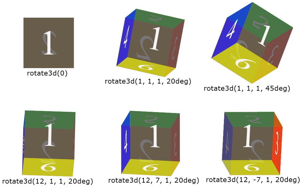
CSS rotate3d() Syntax
The syntax of rotate3d() function in CSS, is:
transform: rotate3d(x, y, z, degree);
The value of x, y, and z will be a positive, zero, or a negative number. Whereas the value of degree will be any of the following:
- deg - Stands for degree. One full circle is equal to 360deg
- grad - Stands for gradians. One full circle is equal to 400grad
- rad - Stands for Radians. One full circle is equal to 6.2832rad
- turn - Stands for turns. One full circle is equal to 1turn
Therefore, the rotate3d() function is used to apply rotateX(), rotateY(), and rotateZ() at once, with specified degree. Therefore, the general form of rotate3d(), can also be written as:
transform: rotate3d(rotateX(), rotateY(), rotateZ(), degree);
« Previous Tutorial Next Tutorial »