- CSS Basics
- CSS Tutorial
- CSS Where to Write
- CSS Syntax
- CSS Selectors
- CSS Combinators
- CSS Attribute Selectors
- CSS Pseudo Classes
- CSS Pseudo-Classes
- CSS :link :hover :active
- CSS :first-child
- CSS :first-of-type
- CSS :last-child
- CSS :last-of-type
- CSS :only-child
- CSS :only-of-type
- CSS :nth-child()
- CSS :nth-of-type()
- CSS :nth-last-child()
- CSS :nth-last-of-type()
- CSS :focus
- CSS :not()
- CSS :root
- CSS :empty
- CSS :target
- CSS :lang()
- CSS :valid
- CSS :invalid
- CSS :optional
- CSS :required
- CSS :in-range
- CSS :out-of-range
- CSS :enabled :disabled
- CSS :read-only
- CSS :read-write
- CSS Pseudo Elements
- CSS Pseudo-Elements
- CSS ::before
- CSS ::after
- CSS ::first-letter
- CSS ::first-line
- CSS ::marker
- CSS ::selection
- CSS Colors
- CSS Colors
- CSS rgb() and rgba()
- CSS hsl() and hsla()
- CSS Background
- CSS background
- CSS background-color
- CSS background-image
- CSS linear-gradient()
- CSS radial-gradient()
- CSS conic-gradient()
- CSS repeating-linear-gradient()
- CSS repeating-radial-gradient()
- CSS repeating-conic-gradient()
- CSS background-position
- CSS background-size
- CSS background-repeat
- CSS background-origin
- CSS background-clip
- CSS background-attachment
- CSS background-blend-mode
- CSS Border
- CSS border
- CSS border-style
- CSS border-style Values
- CSS border-width
- CSS border-color
- CSS border-top
- CSS border-top-style
- CSS border-top-width
- CSS border-top-color
- CSS border-bottom
- CSS border-bottom-style
- CSS border-bottom-width
- CSS border-bottom-color
- CSS border-left
- CSS border-left-style
- CSS border-left-width
- CSS border-left-color
- CSS border-right
- CSS border-right-style
- CSS border-right-width
- CSS border-right-color
- CSS border-top-left-radius
- CSS border-top-right-radius
- CSS border-bottom-left-radius
- CSS border-bottom-right-radius
- CSS border-radius
- CSS border-collapse
- CSS empty-cells
- CSS border-spacing
- CSS border-image
- CSS border-image-source
- CSS border-image-slice
- CSS border-image-width
- CSS border-image-outset
- CSS border-image-repeat
- CSS Fonts
- CSS font
- CSS font-style
- CSS font-variant
- CSS font-variant-caps
- CSS font-weight
- CSS font-size
- CSS line-height
- CSS font-family
- CSS font-stretch
- CSS font-kerning
- CSS font-face
- CSS font-feature-settings
- CSS Text
- CSS Text
- CSS color
- CSS text-decoration
- CSS text-decoration-line
- CSS text-decoration-color
- CSS text-decoration-style
- CSS text-underline-position
- CSS text-align
- CSS text-align-last
- CSS text-justify
- CSS letter-spacing
- CSS word-spacing
- CSS text-shadow
- CSS text-transform
- CSS white-space
- CSS text-indent
- CSS word-wrap
- CSS overflow-wrap
- CSS word-break
- CSS text-overflow
- CSS hyphens
- CSS direction
- CSS unicode-bidi
- CSS writing-mode
- CSS Padding & Margin
- CSS Box Model
- CSS padding
- CSS padding-top
- CSS padding-right
- CSS padding-bottom
- CSS padding-left
- CSS margin
- CSS margin-top
- CSS margin-right
- CSS margin-bottom
- CSS margin-left
- CSS Padding Vs Margin
- CSS Dimensions
- CSS Dimensions
- CSS height
- CSS max-height
- CSS min-height
- CSS width
- CSS max-width
- CSS min-width
- CSS overflow
- CSS overflow-x
- CSS overflow-y
- CSS Multi-Column Layout
- CSS Multi-Column Layout
- CSS columns
- CSS column-width
- CSS column-count
- CSS column-rule
- CSS column-rule-width
- CSS column-rule-style
- CSS column-rule-color
- CSS column-span
- CSS column-fill
- CSS Display
- CSS display
- CSS inline Vs block
- CSS inline Vs inline-block
- CSS flex Vs inline-flex
- CSS inline-flex Vs inline-block
- CSS flex Vs grid
- CSS grid Vs inline-grid
- CSS Float and Position
- CSS float
- CSS clear
- CSS Align
- CSS position
- CSS left
- CSS right
- CSS top
- CSS bottom
- CSS Style List Marker
- CSS Style List Marker
- CSS list-style
- CSS list-style-type
- CSS list-style-position
- CSS list-style-image
- CSS Outline
- CSS outline
- CSS outline-width
- CSS outline-style
- CSS outline-color
- CSS outline-offset
- CSS Effects
- CSS Effects
- CSS Gradients
- CSS Shadows
- CSS box-shadow
- CSS opacity
- CSS Transforms
- CSS transform
- CSS translateX()
- CSS translateY()
- CSS translateZ()
- CSS translate()
- CSS translate3d()
- CSS scaleX()
- CSS scaleY()
- CSS scaleZ()
- CSS scale()
- CSS scale3d()
- CSS rotateX()
- CSS rotateY()
- CSS rotateZ()
- CSS rotate()
- CSS rotate3d()
- CSS skewX()
- CSS skewY()
- CSS skew()
- CSS matrix()
- CSS matrix3d()
- CSS perspective() Function
- CSS perspective Property
- CSS perspective-origin
- CSS transform-style
- CSS transform-origin
- CSS 2D Transform
- CSS 3D Transform
- CSS Transition
- CSS transition
- CSS transition-property
- CSS transition-duration
- CSS transition-timing-function
- CSS transition-delay
- CSS Animation
- CSS animation
- CSS @keyframes
- CSS animation-name
- CSS animation-duration
- CSS animation-timing-function
- CSS animation-delay
- CSS animation-iteration-count
- CSS animation-direction
- CSS animation-fill-mode
- CSS animation-play-state
- CSS Grid Layout
- CSS Grid Layout
- CSS gap
- CSS column-gap
- CSS row-gap
- CSS grid-area
- CSS grid-column-start
- CSS grid-column-end
- CSS grid-row-start
- CSS grid-row-end
- CSS grid-template
- CSS grid-template-columns
- CSS grid-template-rows
- CSS grid-template-areas
- CSS grid-auto-columns
- CSS grid-auto-rows
- CSS grid-auto-flow
- CSS grid-column
- CSS grid-row
- CSS Template Layout
- CSS Flex Layout
- CSS FlexBox
- CSS flex-direction
- CSS flex-wrap
- CSS flex-flow
- CSS justify-content
- CSS align-content
- CSS align-items
- CSS flex-grow
- CSS flex-shrink
- CSS flex-basis
- CSS flex
- CSS align-self
- CSS order
- CSS Misc
- CSS Length Units
- CSS Style Link
- CSS Navigation Bar
- CSS Style Image
- CSS Style Tables
- CSS table-layout
- CSS caption-side
- CSS Create Frames
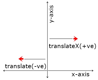
CSS transform: translateX()
The CSS translateX() function is used to define the transform property, to move an element right/left on x-axis. The figure given below, shows how the translation of an element on x-axis performs:
For example:
HTML with CSS Code
<!DOCTYPE html>
<html>
<head>
   <style>
      div{width: 120px; height: 60px; background: peru; margin: auto;}
      .b{transform: translateX(20px);}
      .c{transform: translateX(-20px);}
      .d{transform: translateX(60px);}
      .e{transform: translateX(-60px);}
   </style>
</head>
<body>

   <h2>Without translateX()</h2>
   <div class="a"></div>

   <h2>translateX(20px)</h2>
   <div class="b"></div>

   <h2>translateX(-20px)</h2>
   <div class="c"></div>

   <h2>translateX(60px)</h2>
   <div class="d"></div>

   <h2>translateX(-60px)</h2>
   <div class="e"></div>

</body>
</html>
Output
Without translateX()
translateX(20px)
translateX(-20px)
translateX(60px)
translateX(-60px)
CSS translateX() Syntax
The syntax of translateX() function in CSS, is:
transform: translateX(length)
Note - Length units that can be used in CSS, are defined in its separate tutorial.
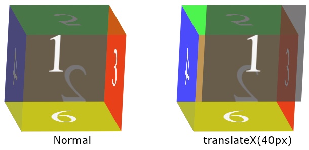
The following figure shows two 3D boxes (Dice). The first one is a normal die, whereas I've applied the transform: translateX(40px) to the front face (the face with value 1) of the second die.
« Previous Tutorial Next Tutorial »