- CSS Basics
- CSS Tutorial
- CSS Where to Write
- CSS Syntax
- CSS Selectors
- CSS Combinators
- CSS Attribute Selectors
- CSS Pseudo Classes
- CSS Pseudo-Classes
- CSS :link :hover :active
- CSS :first-child
- CSS :first-of-type
- CSS :last-child
- CSS :last-of-type
- CSS :only-child
- CSS :only-of-type
- CSS :nth-child()
- CSS :nth-of-type()
- CSS :nth-last-child()
- CSS :nth-last-of-type()
- CSS :focus
- CSS :not()
- CSS :root
- CSS :empty
- CSS :target
- CSS :lang()
- CSS :valid
- CSS :invalid
- CSS :optional
- CSS :required
- CSS :in-range
- CSS :out-of-range
- CSS :enabled :disabled
- CSS :read-only
- CSS :read-write
- CSS Pseudo Elements
- CSS Pseudo-Elements
- CSS ::before
- CSS ::after
- CSS ::first-letter
- CSS ::first-line
- CSS ::marker
- CSS ::selection
- CSS Colors
- CSS Colors
- CSS rgb() and rgba()
- CSS hsl() and hsla()
- CSS Background
- CSS background
- CSS background-color
- CSS background-image
- CSS linear-gradient()
- CSS radial-gradient()
- CSS conic-gradient()
- CSS repeating-linear-gradient()
- CSS repeating-radial-gradient()
- CSS repeating-conic-gradient()
- CSS background-position
- CSS background-size
- CSS background-repeat
- CSS background-origin
- CSS background-clip
- CSS background-attachment
- CSS background-blend-mode
- CSS Border
- CSS border
- CSS border-style
- CSS border-style Values
- CSS border-width
- CSS border-color
- CSS border-top
- CSS border-top-style
- CSS border-top-width
- CSS border-top-color
- CSS border-bottom
- CSS border-bottom-style
- CSS border-bottom-width
- CSS border-bottom-color
- CSS border-left
- CSS border-left-style
- CSS border-left-width
- CSS border-left-color
- CSS border-right
- CSS border-right-style
- CSS border-right-width
- CSS border-right-color
- CSS border-top-left-radius
- CSS border-top-right-radius
- CSS border-bottom-left-radius
- CSS border-bottom-right-radius
- CSS border-radius
- CSS border-collapse
- CSS empty-cells
- CSS border-spacing
- CSS border-image
- CSS border-image-source
- CSS border-image-slice
- CSS border-image-width
- CSS border-image-outset
- CSS border-image-repeat
- CSS Fonts
- CSS font
- CSS font-style
- CSS font-variant
- CSS font-variant-caps
- CSS font-weight
- CSS font-size
- CSS line-height
- CSS font-family
- CSS font-stretch
- CSS font-kerning
- CSS font-face
- CSS font-feature-settings
- CSS Text
- CSS Text
- CSS color
- CSS text-decoration
- CSS text-decoration-line
- CSS text-decoration-color
- CSS text-decoration-style
- CSS text-underline-position
- CSS text-align
- CSS text-align-last
- CSS text-justify
- CSS letter-spacing
- CSS word-spacing
- CSS text-shadow
- CSS text-transform
- CSS white-space
- CSS text-indent
- CSS word-wrap
- CSS overflow-wrap
- CSS word-break
- CSS text-overflow
- CSS hyphens
- CSS direction
- CSS unicode-bidi
- CSS writing-mode
- CSS Padding & Margin
- CSS Box Model
- CSS padding
- CSS padding-top
- CSS padding-right
- CSS padding-bottom
- CSS padding-left
- CSS margin
- CSS margin-top
- CSS margin-right
- CSS margin-bottom
- CSS margin-left
- CSS Padding Vs Margin
- CSS Dimensions
- CSS Dimensions
- CSS height
- CSS max-height
- CSS min-height
- CSS width
- CSS max-width
- CSS min-width
- CSS overflow
- CSS overflow-x
- CSS overflow-y
- CSS Multi-Column Layout
- CSS Multi-Column Layout
- CSS columns
- CSS column-width
- CSS column-count
- CSS column-rule
- CSS column-rule-width
- CSS column-rule-style
- CSS column-rule-color
- CSS column-span
- CSS column-fill
- CSS Display
- CSS display
- CSS inline Vs block
- CSS inline Vs inline-block
- CSS flex Vs inline-flex
- CSS inline-flex Vs inline-block
- CSS flex Vs grid
- CSS grid Vs inline-grid
- CSS Float and Position
- CSS float
- CSS clear
- CSS Align
- CSS position
- CSS left
- CSS right
- CSS top
- CSS bottom
- CSS Style List Marker
- CSS Style List Marker
- CSS list-style
- CSS list-style-type
- CSS list-style-position
- CSS list-style-image
- CSS Outline
- CSS outline
- CSS outline-width
- CSS outline-style
- CSS outline-color
- CSS outline-offset
- CSS Effects
- CSS Effects
- CSS Gradients
- CSS Shadows
- CSS box-shadow
- CSS opacity
- CSS Transforms
- CSS transform
- CSS translateX()
- CSS translateY()
- CSS translateZ()
- CSS translate()
- CSS translate3d()
- CSS scaleX()
- CSS scaleY()
- CSS scaleZ()
- CSS scale()
- CSS scale3d()
- CSS rotateX()
- CSS rotateY()
- CSS rotateZ()
- CSS rotate()
- CSS rotate3d()
- CSS skewX()
- CSS skewY()
- CSS skew()
- CSS matrix()
- CSS matrix3d()
- CSS perspective() Function
- CSS perspective Property
- CSS perspective-origin
- CSS transform-style
- CSS transform-origin
- CSS 2D Transform
- CSS 3D Transform
- CSS Transition
- CSS transition
- CSS transition-property
- CSS transition-duration
- CSS transition-timing-function
- CSS transition-delay
- CSS Animation
- CSS animation
- CSS @keyframes
- CSS animation-name
- CSS animation-duration
- CSS animation-timing-function
- CSS animation-delay
- CSS animation-iteration-count
- CSS animation-direction
- CSS animation-fill-mode
- CSS animation-play-state
- CSS Grid Layout
- CSS Grid Layout
- CSS gap
- CSS column-gap
- CSS row-gap
- CSS grid-area
- CSS grid-column-start
- CSS grid-column-end
- CSS grid-row-start
- CSS grid-row-end
- CSS grid-template
- CSS grid-template-columns
- CSS grid-template-rows
- CSS grid-template-areas
- CSS grid-auto-columns
- CSS grid-auto-rows
- CSS grid-auto-flow
- CSS grid-column
- CSS grid-row
- CSS Template Layout
- CSS Flex Layout
- CSS FlexBox
- CSS flex-direction
- CSS flex-wrap
- CSS flex-flow
- CSS justify-content
- CSS align-content
- CSS align-items
- CSS flex-grow
- CSS flex-shrink
- CSS flex-basis
- CSS flex
- CSS align-self
- CSS order
- CSS Misc
- CSS Length Units
- CSS Style Link
- CSS Navigation Bar
- CSS Style Image
- CSS Style Tables
- CSS table-layout
- CSS caption-side
- CSS Create Frames
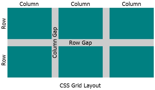
CSS grid (Grid Layout with Example)
The CSS grid is used to design or layout a web page based on grid layout model. In grid layout model, everything is separated in the form of rows and columns. For example:
<!DOCTYPE html>
<html>
<head>
   <style>
      .container {display: grid; gap: 2px; background-color: chocolate; color: whitesmoke;
         grid-template-areas: 'head head head' 'nav main oth' 'foot foot foot';}
      .container > div {background-color: maroon; padding: 10px; text-align: center;}
      #header {grid-area: head;}
      #menu {grid-area: nav;}
      #content {grid-area: main;}
      #other {grid-area: oth;}
      #footer {grid-area: foot;}
   </style>
</head>
<body>

   <div class="container">
      <div id="header">HEADER</div>
      <div id="menu">MENU</div>
      <div id="content">CONTENT</div>
      <div id="other">OTHER</div>
      <div id="footer">FOOTER</div>
   </div>

</body>
</html>
This is just a demo example to show the sample of grid layout model. You'll learn all about layout designing using grid layout model, one by one, starting from next article/tutorial.
CSS Grid Layout Model
CSS Grid Elements
Grid elements are those elements that are the direct child of grid container or an element whose display property is set to grid or inline-grid. For example:
<!DOCTYPE html>
<html>
<head>
   <style>
      .container {display: grid; gap: 4px; background-color: peru; color: whitesmoke;
         grid-template-columns: auto auto auto;}
      .container > div {background-color: maroon; padding: 10px; text-align: center;}
   </style>
</head>
<body>

   <div class="container">
      <div>A</div>
      <div>B</div>
      <div>
         <div>C1</div>
         <div>C2</div>
         <div>C3</div>
      </div>
      <div>D</div>
      <div>E</div>
      <div>F</div>
   </div>

</body>
</html>
In above example, because the DIV with class container is set to grid using the following CSS code:
.container {display: grid;}
And this DIV with container class has other DIVs inside it. Those all DIVs are its child elements. Therefore the direct child becomes the grid items of this DIV.
Note - In CSS, a grid layout consists of a parent with one or multiple child elements.
Note - I've described grid Vs inline-grid and flex Vs grid in its separate tutorial.
What is CSS Grid Used For ?
CSS grid is used to layout a/some part(s) of a web page or the whole web page in the form of rows and columns.
List of All CSS Grid Properties
- gap - used to define the gap between rows and columns in grid layout
- column-gap - used to define the gap between columns in grid layout
- row-gap - used to define the gap between rows in grid layout
- grid-area - used to define the location and size of a grid item in grid layout
- grid-column-start - used to define the starting column position of a grid item in grid layout
- grid-column-end - used to span a grid item for specified number of columns. Or to define the ending column position of a grid item in grid layout
- grid-row-start - used to define the starting row position of a grid item in grid layout
- grid-row-end - used to span a grid item for specified number of rows. Or to define the ending row position of a grid item in grid layout
- grid-template - used to define the size of grid items based on rows and columns or areas
- grid-template-columns - used to define the number of columns to create in grid layout
- grid-template-rows - used to define the height of a/multiple row(s) in grid layout
- grid-template-areas - used to define the area of a/multiple grid item(s) in grid layout
- grid-auto-columns - used to define the default size (width) for all columns in grid layout
- grid-auto-rows - used to define the default size (height) for all rows in grid layout
- grid-auto-flow - used to define the flow of auto-placed grid items in grid layout, based on the value assigned to it
- grid-column - used to define the column start and end position of a grid item in grid layout, to place the item at desired position with specified number of columns (spaces/widths)
- grid-row - used to define the row start and end position of a grid item in grid layout, to place the item at desired position with specified number of rows (spaces/heights)
« Previous Tutorial Next Tutorial »